Overview
Nalipo is a small German brand making sustainable products for children — grain pillows, art prints, colouring pages. Lovely products, but an online shop that undersold them.
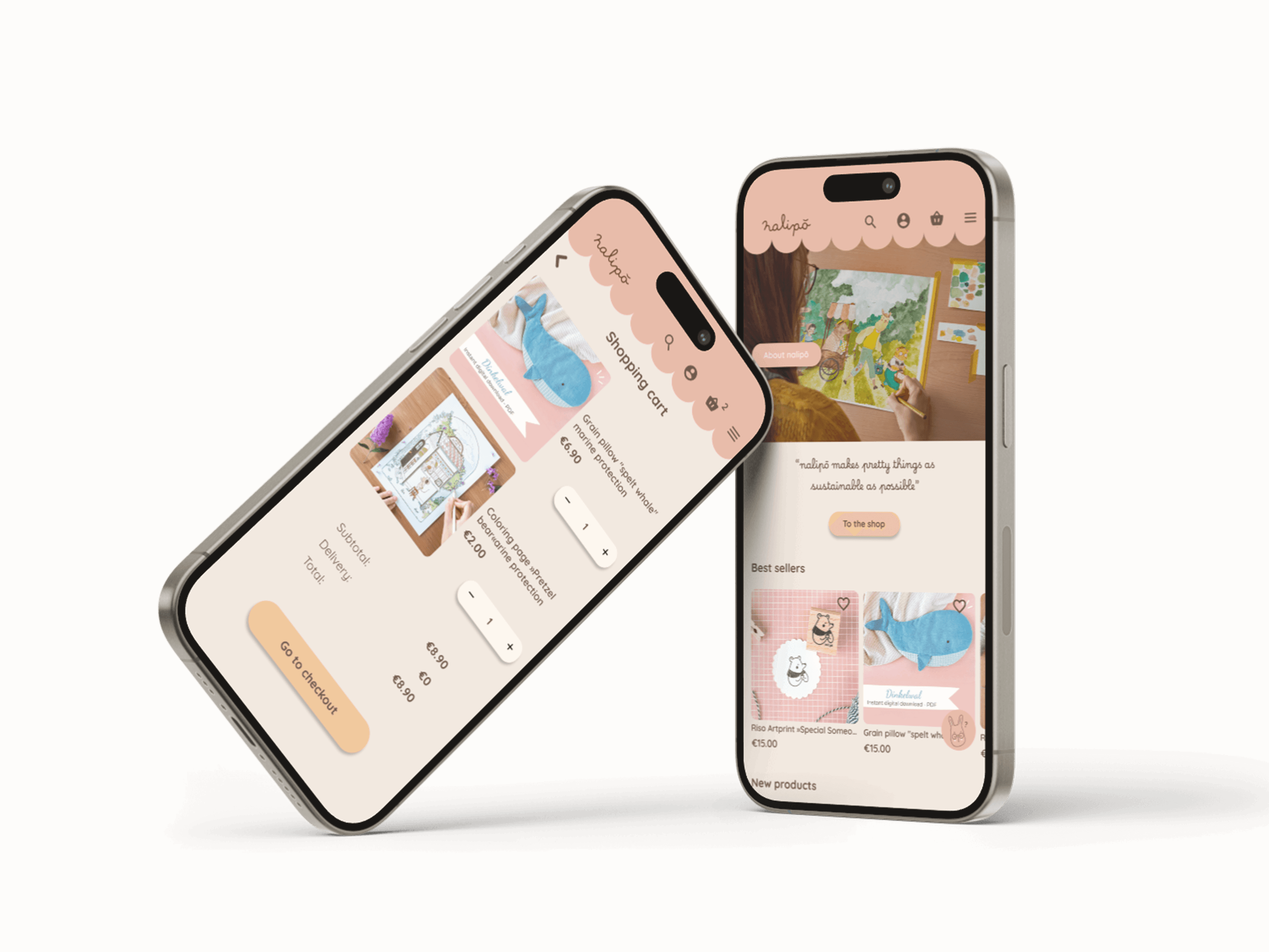
Our team redesigned the store end to end: navigation, product pages, cart and a refreshed identity — with the brand promise front and centre: “nalipō makes pretty things as sustainable as possible.”
The full process is documented publicly in my Medium article.
Challenge
- Shoppers couldn’t quickly grasp what Nalipo sold or why it was different.
- Product discovery relied on scrolling instead of navigation.
- The checkout journey didn’t reflect the care behind the products.
Approach
Structure before decoration
We rebuilt the information architecture around how customers actually shop — by occasion and recipient — then validated it with card sorting and quick usability rounds.
Trust in the details
Sustainability claims became visible, specific and placed at decision moments: material notes on product cards, certifications near the price, honest delivery information in the cart.
A gentle identity
Soft blush tones, a scalloped header and handwritten accents keep the brand’s warmth while a clear typographic hierarchy does the selling.
Outcome
A real client, shipped thinking
Recommendations delivered to a live business, grounded in testing.
Published process
The full case study is public on Medium — method, mistakes and all.
Calmer conversion path
From landing to checkout in fewer, clearer steps.