Overview
Nobody browses a car-repair website for pleasure — they scan it under pressure, often with a dashboard warning light already on. APEX needed to answer one question immediately: can this workshop fix my problem, and how fast.
I designed and built the complete site end to end — and, before settling on the final direction, built a full second structural variant to compare against it.
Challenge
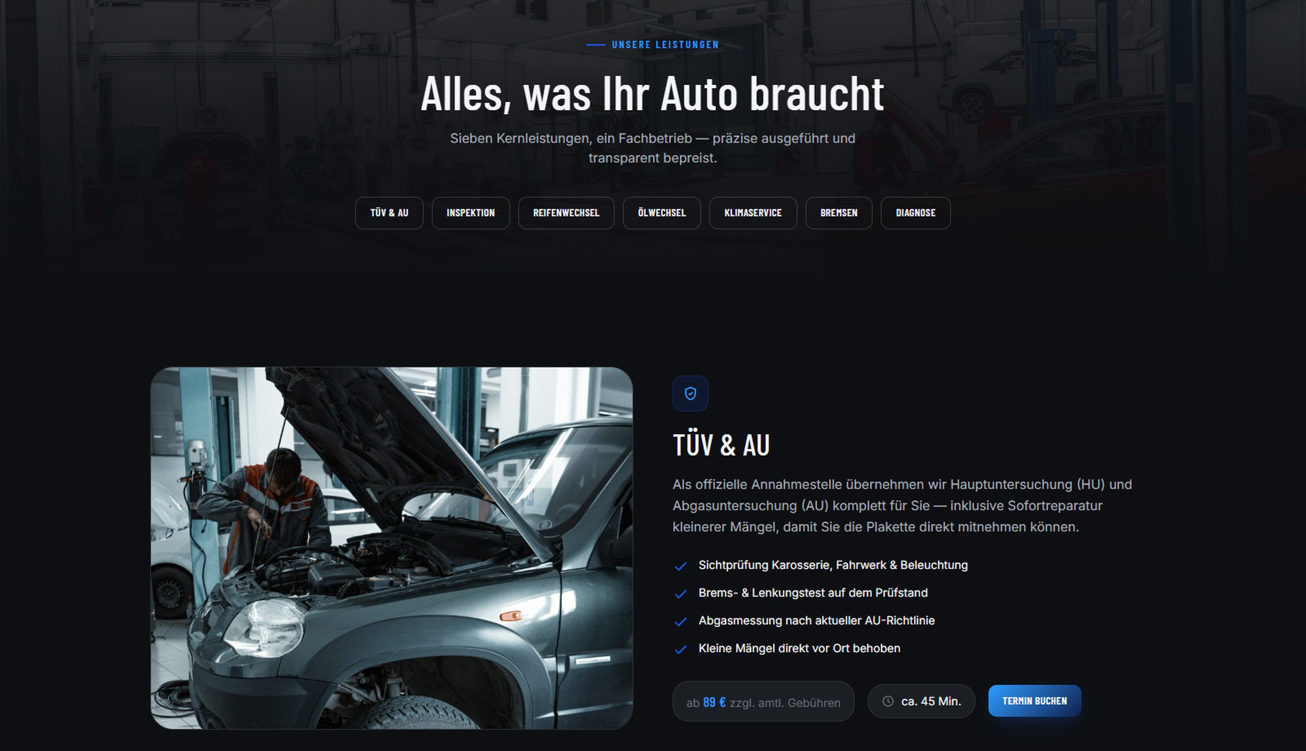
- Seven distinct services (TÜV, inspection, tyres, oil, AC, brakes, diagnostics) needed to be scannable in seconds, not buried in a dropdown.
- A dark, technical mood had to read as confident and precise — not cold or intimidating.
- The first idea isn’t always the strongest one — worth proving before committing.
Approach
Two variants, one decision
Designed a second homepage structure from scratch — a different navigation pattern, a data-strip hero, an annotated engine diagram — purely to stress-test whether the original direction was actually the strongest, not just the first.
Direct-to-service navigation
An icon strip under the hero links straight into all seven services, so nothing important lives two clicks deep.
Price and time, not just a photo
Every service pairs a real workshop photograph with a starting price and a duration estimate, so the decision to book needs no further digging.
A confident, technical accent
The charcoal-and-accent palette went through several iterations by eye until it read as precise and trustworthy rather than flashy.
Outcome
Booking in three taps
Homepage to a chosen service to a confirmed appointment, no dead ends.
Every service, priced and timed
All seven services show cost and duration up front.
The stronger structure, proven
A second full variant was built and set aside once testing confirmed the simpler, direct layout served visitors better.