Overview
AURELIA is a hair and beauty studio selling calm as much as it sells a haircut. The brief was explicit: no generic beauty-template pink — this needed to feel like a considered, quiet-luxury space from the first scroll.
I designed and built all seven pages end to end — home, services, pricing, gallery, team, booking and contact — as one coherent identity, not seven separately designed screens.
Challenge
- Most salon templates reach for the same pastel palette, which reads young and inexpensive rather than premium.
- Seven pages needed one visual language, not seven separately designed screens.
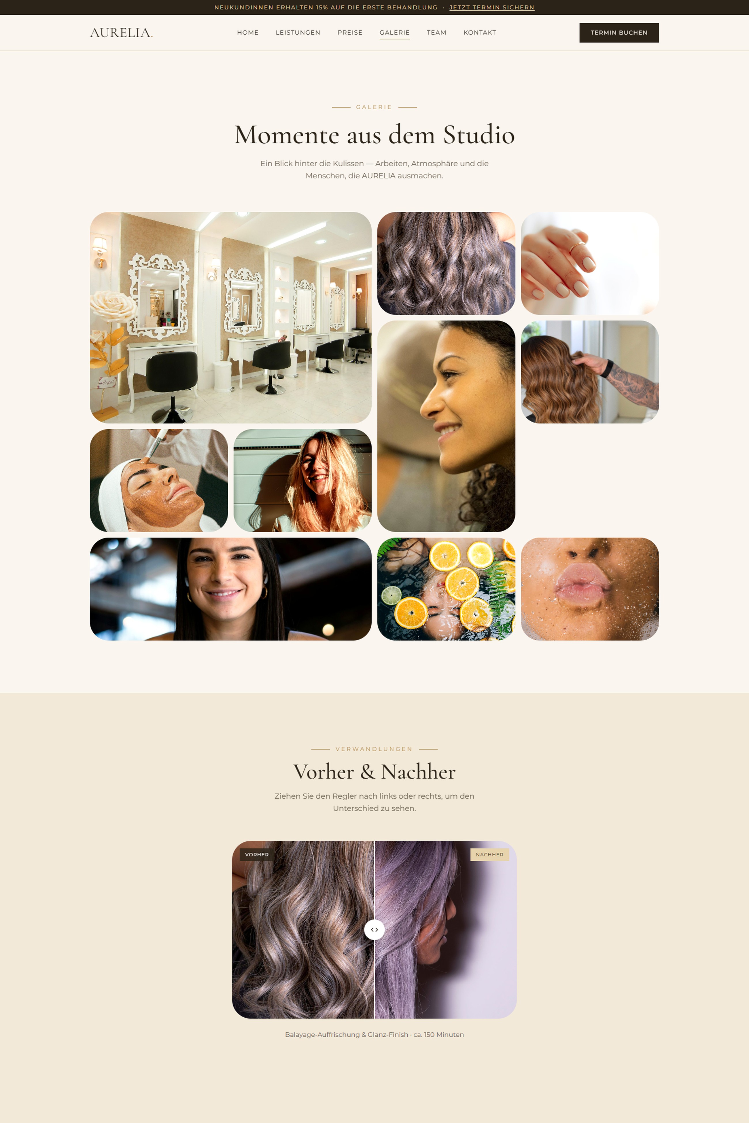
- Before/after results are a salon’s strongest proof — but slider gimmicks can look more like marketing than evidence.
Approach
A deliberate palette shift
Warm beige, gold and white replace the expected pink/lavender beauty-template default — paired with an editorial serif (Cormorant Garamond) and a clean sans (Montserrat) for a studio that reads considered, not cute.
Proof you can drag
An interactive before/after slider and a real photo gallery carry the “does this actually work” question, rather than a paragraph of adjectives.
One shoot, one mood
Every photo — team, services, studio interior — was individually checked and colour-matched by eye so a set of sourced images reads as a single, consistent shoot.
Soft-glass surfaces
Frosted, blurred card panels echo the tactile softness of a spa environment across all seven pages, not just the homepage hero.
Walkthrough
A hero that earns the scroll
The homepage hero blends a cut-out portrait straight into the page’s own gradient instead of boxing it inside a photo frame — after several framed attempts, dropping the frame entirely was what made the hero feel like part of the page rather than a stock photo pasted on top of it. A frosted glass panel carries the headline and stats without hiding the portrait behind it.
Every service, one consistent frame
The rounded-corner treatment from the hero extends across all four service categories — photo and price teaser share a single frame instead of the image rounding independently from a square text panel beneath it, so scrolling through services reads as one continuous surface rather than stacked cards.
One clear price, one clear tab
Tabbed pricing keeps four service categories from overwhelming a single long list, with exactly one visibly active tab at a time — and the gift-card section is styled as its own quiet upsell rather than a banner shouting for attention.
Getting in touch without friction
A contact form, live map and FAQ accordion all live on one page, so a visitor never has to hunt across the site for a phone number — styled with the same calm, glass-panelled language as everywhere else, instead of the usual bare utility page.
Outcome
Seven pages, one voice
Home through contact share one calm, consistent identity.
Proof, not promises
A working before/after slider visitors can control themselves.
A palette that reads premium
Moved deliberately away from the generic beauty-template look.