Overview
Nordent is a modern dental practice in Munich competing for two very different visitors at once: routine patients calmly comparing options, and acute-pain patients who need help right now.
I designed and built the complete site end to end — structure, brand palette, copy direction and the full front-end — so both journeys could live on one homepage without feeling like two products bolted together.
Challenge
- Dental visits carry real anxiety — clinical-cold sites lose warmth, playful ones lose credibility.
- Someone in pain won’t read a homepage; they need one visible action, not a menu.
- Trust for a health decision has to go further than a star rating — specifics matter.
Approach
A calmer shade of trust
Rebranded the palette from a stock clinical blue to a warmer teal, chosen so the site reads reassuring rather than sterile without losing precision.
An emergency path with its own gravity
A dedicated same-day, 24/7 block sits structurally apart from routine booking, so a visitor in pain never has to search for it.
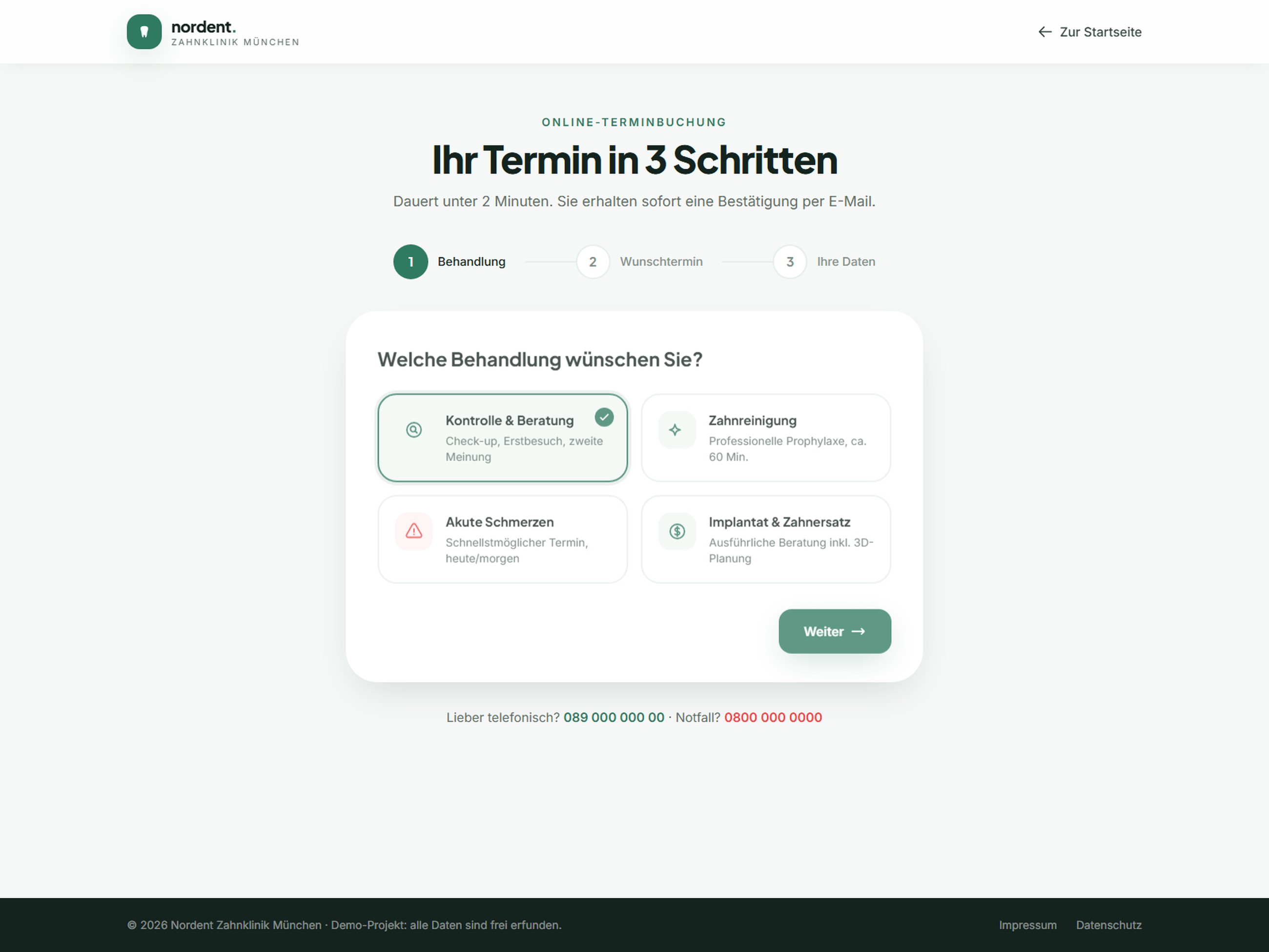
Booking as triage, not paperwork
The appointment flow opens by asking what’s wrong — check-up, cleaning, pain, implant — before it asks for a single personal detail, the same order a receptionist would ask.
Trust made specific
Real rating distributions, verified-review badges and visible practice replies replace the generic “5 stars, trust us” most competitors default to.
Outcome
Two journeys, one site
Routine and emergency patients each reach their goal from the same homepage, no detours.
Booking without dread
A 3-step flow that opens with empathy, not a form.
One consistent practice
Team, treatment-room and before/after photography graded into a single believable identity.