Overview
Landgasthof Senger is a family-run country restaurant and guesthouse. Guests choose places like this with their hearts — so the website’s job was atmosphere first, information a close second.
I designed and developed the complete site: menu presentation, rooms, story of the house and a reservation path — delivered end to end with an AI-accelerated build process.
01 · Problem Analysis
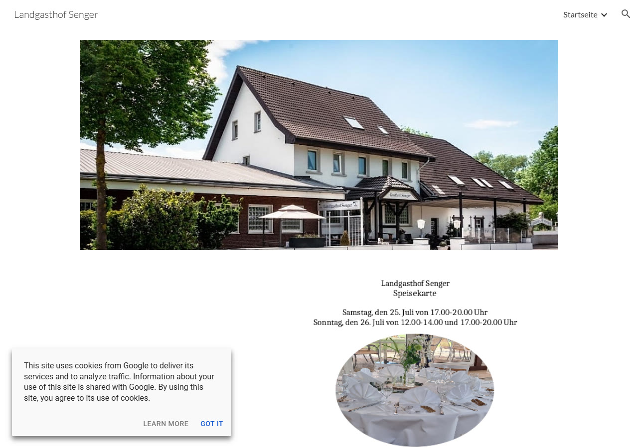
Before any design work started, the family was already running on a website — a free Google Sites page. I audited it the way I’d audit any brief: what does a real visitor actually get when they land here?
- Built on the free Google Sites template — still on a
sites.google.comsubdomain, with Google’s own cookie banner and “Powered by Google Sites” footer sitting between the guest and the business. - No real menu: the only “Speisekarte” content on the entire page was a two-line note about one specific weekend’s set menu — not something a guest could check before any other visit.
- No reservation path of any kind — no form, no booking link, not even a
mailto:shortcut. Booking a table means already knowing the phone number. - Single page, no story: past a hero photo, a phone number and an address, nothing explains what the Landgasthof is or why to choose it over the next gasthof down the road.
- Every image ships with an empty
altattribute — a screen-reader visitor gets zero information about what they’re looking at.
02 · Competitor Analysis
Rather than name-and-shame specific businesses, I looked at the pattern most small German countryside restaurants share, since Landgasthof Senger’s old site is a textbook example of it.
Builder-platform lock-in
Wix, Jimdo and Google Sites templates dominate the category — recognisable stock layouts with no visual identity of their own.
The menu is a PDF (or a photo)
Where a menu exists at all, it’s usually a scanned PDF or a phone photo of a printed page — unreadable on mobile, and stale the day prices change.
Zero booking path
Almost none offer an online reservation form; the entire conversion path is “call during opening hours.”
Placeholder · add named competitors
This section currently documents category-wide patterns. To make it specific, drop in 2–3 screenshots of real gasthof/restaurant sites from the Geseke & Erwitte area with a one-line note on what each one gets right or wrong.
Approach
Atmosphere as information
Typography, pacing and imagery do the welcoming before a single fact is read. Practical details — hours, directions, reservations — stay one tap away at all times.
Menus without PDFs
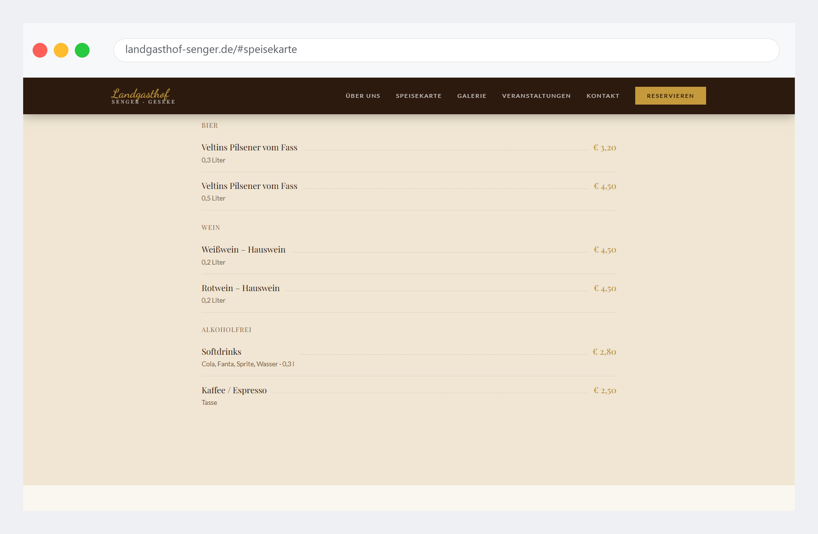
Dishes live in structured, styled HTML: quick for guests to browse, and simple for the owners to update — no design software required.
One hand, whole delivery
From concept and layout to the working front end, everything came from a single workflow. The AI-assisted process kept the timeline short and the details consistent.
03 · Wireframe
Structure came before styling: page order, section hierarchy and where the reservation CTA would sit were decided before any colour or typography choice.
Placeholder · add wireframe
A low-fidelity structure pass showing the homepage flow — hero → about → menu tabs → gallery → events → reservation → contact — belongs here. A Figma wireframe export or a photographed paper sketch both work; the point is to show the page decided before it was designed.
04 · UI Design
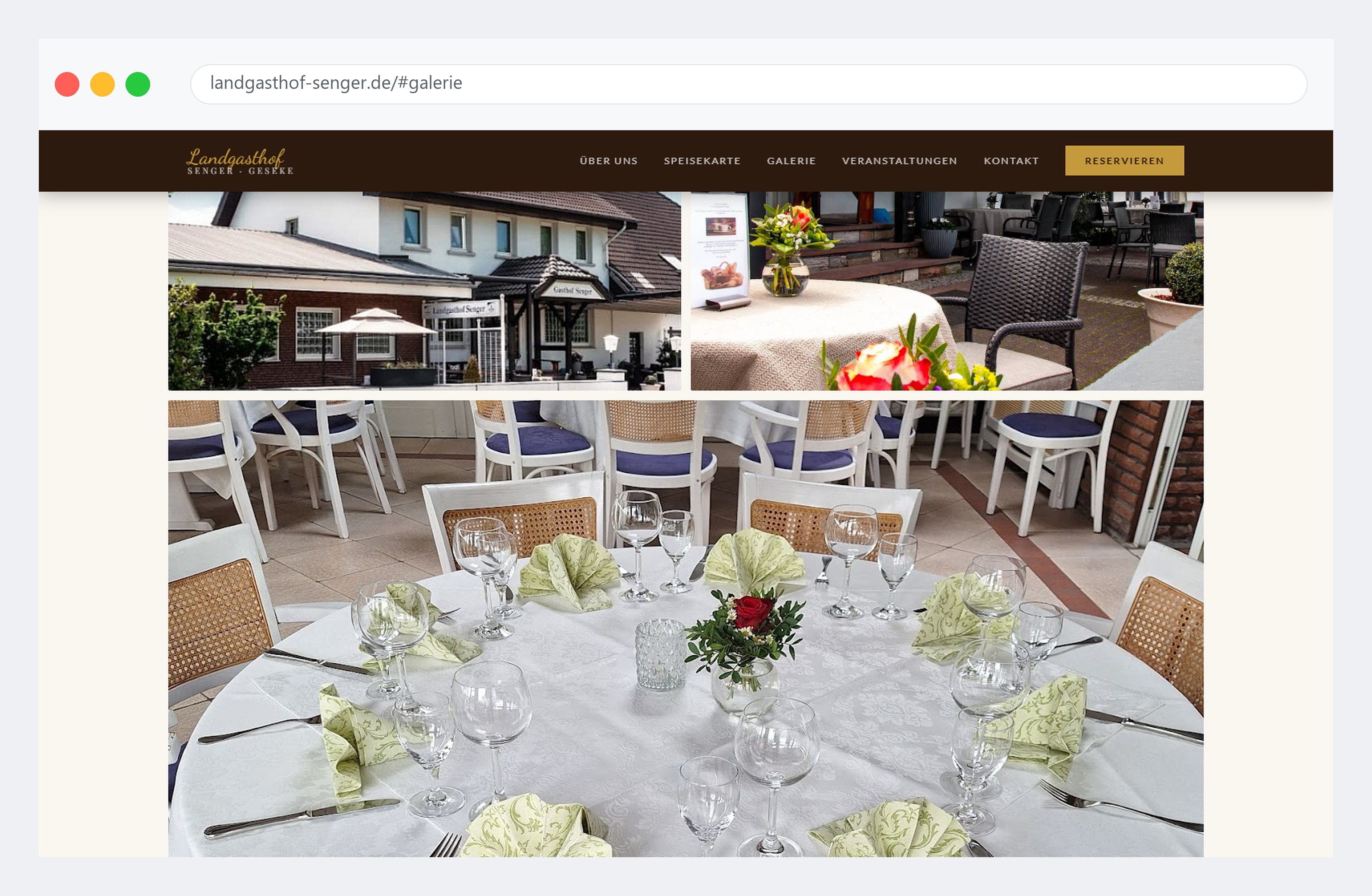
Warm oak and amber tones, an editorial serif for headings and generous whitespace replace the old page’s default template look — applied consistently across the homepage’s ten sections.
05 · Responsive Version
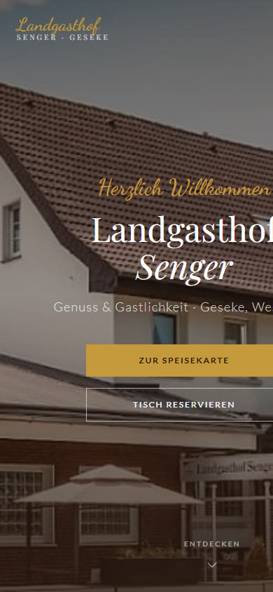
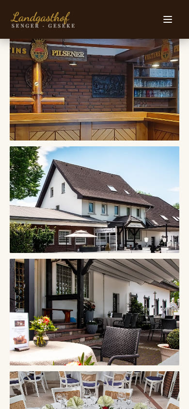
A phone audit surfaced a real bug worth showing, not hiding: the gallery’s wide images carried a fixed aspect-ratio that, combined with the mobile-only fixed height, forced each tile to render 391px wide inside a 375px viewport — a 16px horizontal overflow you could feel as a faint sideways drift while scrolling. The fix was a one-line override (aspect-ratio: unset on mobile) rather than a redesign.
06 · Code
No framework — plain HTML, Tailwind utility classes and a small amount of vanilla JS. The scroll-reveal system and the menu tabs are both under fifteen lines each:
// Scroll-triggered reveal, IntersectionObserver — no scroll-jank library
const observer = new IntersectionObserver(entries => {
  entries.forEach(e => { if(e.isIntersecting) e.target.classList.add('visible') });
}, { threshold: 0.12 });
document.querySelectorAll('.fade-up,.fade-left,.fade-right,.fade-in')
  .forEach(el => observer.observe(el));

// Menu tabs — four categories, one active pane at a time
document.querySelectorAll('.tab-btn').forEach(btn => {
  btn.addEventListener('click', () => {
    document.querySelectorAll('.tab-btn').forEach(b => b.classList.remove('active'));
    document.querySelectorAll('.tab-pane').forEach(p => p.classList.remove('active'));
    btn.classList.add('active');
    document.getElementById('tab-' + btn.dataset.tab).classList.add('active');
  });
});
Real excerpt from the shipped build — no external animation or tab library loaded.
07 · SEO Optimization
Google Sites gives almost no control over SEO fundamentals — no editable meta description, no Open Graph tags, no structured data. A real audit pass on this build (Lighthouse, mobile) still found one gap worth fixing.
Before this audit
- No
<meta name="description">tag - Lighthouse SEO score: 91
After
- Descriptive meta description added, matching the page’s real content and location
- Lighthouse SEO score: 100
Measured with a real local Lighthouse run against the shipped build, not the old Google Sites page (Google Sites doesn’t expose a stable URL to benchmark fairly).
08 · Accessibility (WCAG)
The same audit pass caught two real WCAG failures: reservation-form labels weren’t programmatically linked to their inputs (<label> with no for/id pairing), and several footer links sat just under the 4.5:1 contrast ratio against the dark walnut background.
Before
- Reservation form: labels present visually, unlinked programmatically
- Footer text at 4.38:1 contrast — just under the 4.5:1 minimum
- Lighthouse Accessibility score: 83
After
- Every form field wired with a matching
for/idpair - Footer text opacity raised to a verified 5.9–6.7:1 contrast
- Lighthouse Accessibility score: 100
09 · Performance (Lighthouse)
Honest numbers, not cherry-picked ones: this is a real local Lighthouse run against the shipped build, mobile throttling, no CDN.
64
Performance
100
Accessibility
96
Best Practices
100
SEO
Performance is the honest weak point: Largest Contentful Paint lands at ~11s, driven by an unoptimised full-resolution hero background image with background-attachment: fixed. The identified next step — compressing and responsibly sizing the hero image, and dropping the fixed attachment on mobile where it’s already disabled for scroll performance — isn’t done yet; noted here rather than smoothed over.
Outcome
Complete website
Dining, rooms and reservations — designed, written and built as one piece.
Owner-friendly
Menus and hours are plain HTML the family can edit without a designer.
Light & fast
A static build that loads instantly on rural mobile connections.